
What Great Streaming Design Actually Has to Do With Discovery
A senior entertainment designer's take on why streaming creative is really about discovery, clarity, and recognition. Not just making something look good.
There is a version of this job that looks, from the outside, like visual polish. You take great source material, you make it look cinematic, you hand it off. Job done.
That version is wrong. Or at least, it is not the whole story.
After years of working on streaming campaigns, marquee surfaces, lifecycle marketing and discovery placements, the clearest thing I can tell you about entertainment design is this: the real job is helping the right audience notice, recognize, and choose a title. Not just making it look good. Getting it seen and acted on, in environments that are noisy, fast, and absolutely unforgiving.
That reframe changes everything about how you approach the work.
Streaming surfaces are moments of decision, not passive display
When a viewer opens a streaming app, they are not browsing a gallery. They are making a rapid, low-patience decision about what to watch, often while already doing something else. The design sitting in front of them has a fraction of a second to register, communicate genre and tone, and create enough pull to interrupt the scroll.
A marquee placement is not a billboard on an empty highway. It is a signal competing against every other signal in a crowded interface, most of which the viewer is skipping without fully registering. The same is true for a thumbnail-adjacent unit, a homepage module, or an email hero that lands in an inbox already fighting for attention.
This context is what most people outside the field miss. They see polished key art and assume the design challenge is aesthetic. The actual challenge is communication under pressure.
The constraints that shape the real work
Designing for streaming surfaces means working inside a set of constraints that are nothing like a print campaign or a one-off brand moment. You are thinking about split-second readability, logo-safe area, hierarchy, emotional signal, cast recognition, tonal accuracy and brand consistency across every placement simultaneously.
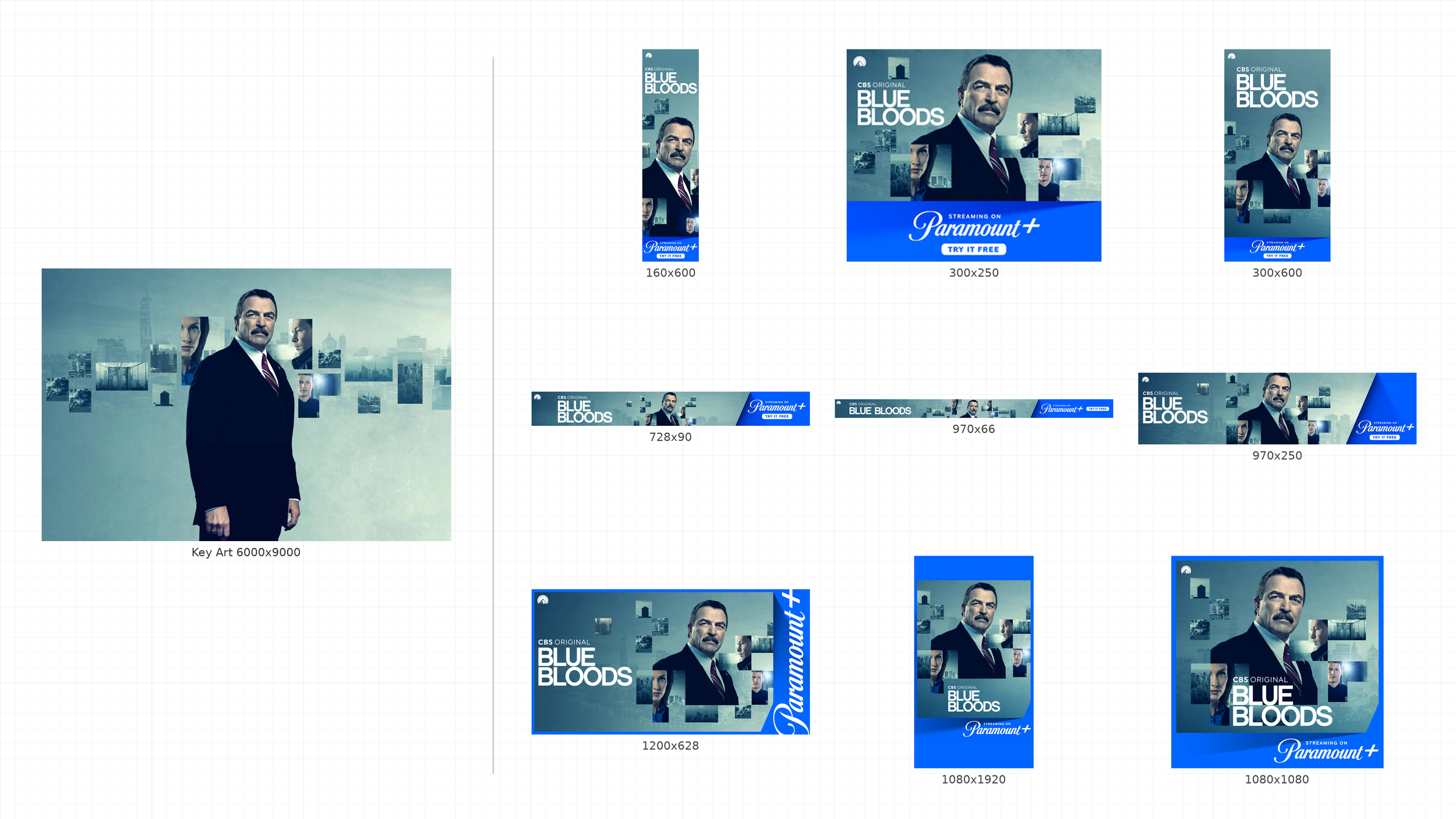
That key art that looks stunning at full bleed on a presentation deck? It still has to work as a 16:9 marquee. And a 4:3 tile. And a 1:1 thumbnail. And an email hero strip. And a display unit running at 300x250 on a third-party site. Every crop is another test of whether the design actually holds.
The version that survives all of those tests is not always the most visually impressive one. It is the one with a clear focal point, a readable title treatment, and a dominant emotional cue that communicates genre or feeling before the viewer has consciously processed it.
Discovery surfaces are ruthless. There is no time for ambiguity.
Why clarity almost always beats visual complexity
One of the recurring tensions in entertainment design is between the instinct to make something rich and layered and the practical reality that layered work often falls apart under real conditions.
Overdesigned creative tends to fail in predictable ways. It gets muddy at smaller sizes. The eye does not know where to go first. The tonal or genre signal gets lost in visual texture. What felt like depth on a large monitor reads as noise on a phone screen or a fast-moving app surface.
Clarity in this context is not the same as simplicity. It means one dominant emotional cue. One readable title treatment. One obvious entry point for the eye. You can still have sophistication in the composition, color, and craft. But those things have to serve the primary communication, not compete with it.
The discipline of designing for discovery is partly the discipline of editing. Knowing what to take out is often more important than knowing what to add.
Recognition has to travel across a whole campaign system
Strong entertainment design is not a single hero image. It is a flexible visual idea that has to survive multiple crops, placements, formats and phases of a campaign without losing its identity.
Think about how a franchise campaign works. Or a seasonal sports package. Or a slate of titles sharing a marquee slot across a rolling schedule. The visual language has to be distinctive enough to be recognizable and flexible enough to carry different content without breaking.
That kind of continuity is a design problem, not just a production one. It requires upfront decisions about what the core visual logic is, which elements are fixed versus flexible, and how the hierarchy needs to adapt per surface. Solving that early makes everything downstream faster and more consistent. Not solving it means creative teams are making judgment calls under deadline that should have been resolved at the system level.
Why this matters to the business
Content discovery is one of the defining challenges in streaming right now. Viewers are navigating a saturated landscape of titles across multiple services, and attention is genuinely fragmented. Research from Gracenote has framed this directly: ineffective content discovery has a measurable impact on subscriber satisfaction.
Design is part of that discovery problem. The creative sitting on a marquee surface or a homepage module is not decoration. It is part of the product experience. It either earns the click or it does not. Done well, it reduces the friction between audience interest and audience action. Done poorly, it blends into the scroll.
This is why entertainment design done at a senior level is not just about craft. It is about understanding what the creative actually needs to do inside the platform, and building toward that outcome rather than toward a portfolio-ready image.
The takeaway
The best streaming design reduces the friction between audience interest and audience action. It works because it is clear, because it communicates fast, because the core idea is strong enough to survive real conditions. That is the work.
The visual quality matters. The craft matters. But both of those things are in service of communication, not the other way around.