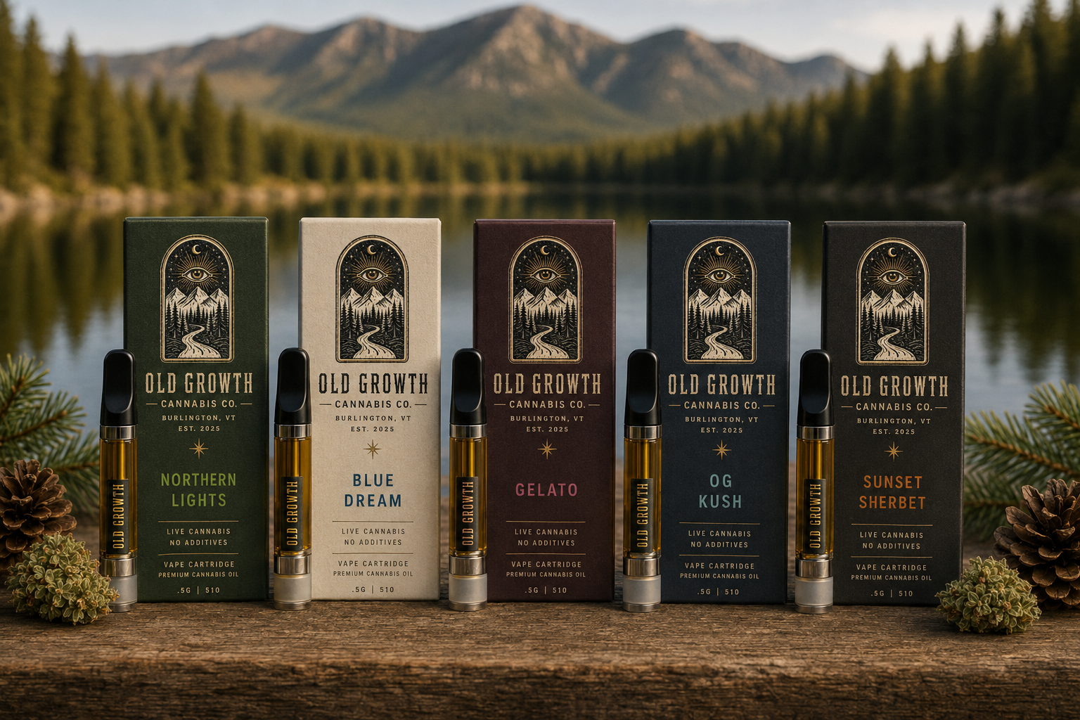
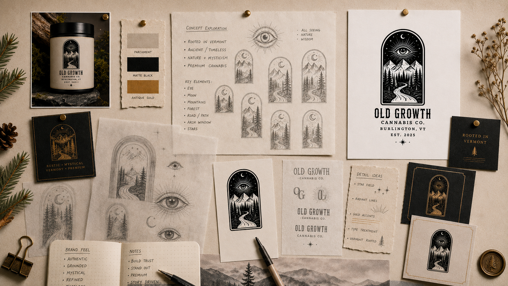
Old Growth Cannabis Co. is a boutique cannabis brand identity concept developed for a premium Vermont-based company rooted in craft, nature, and ritual. The work began with a broad visual exploration of what a cannabis brand could feel like without relying on the usual category clichés: no neon green, no oversized cannabis leaves, no cartoon stoner language, and no generic mountain badge. The goal was to create a system that felt mature, tactile, mystical, and elevated while still being clearly connected to cannabis and place.
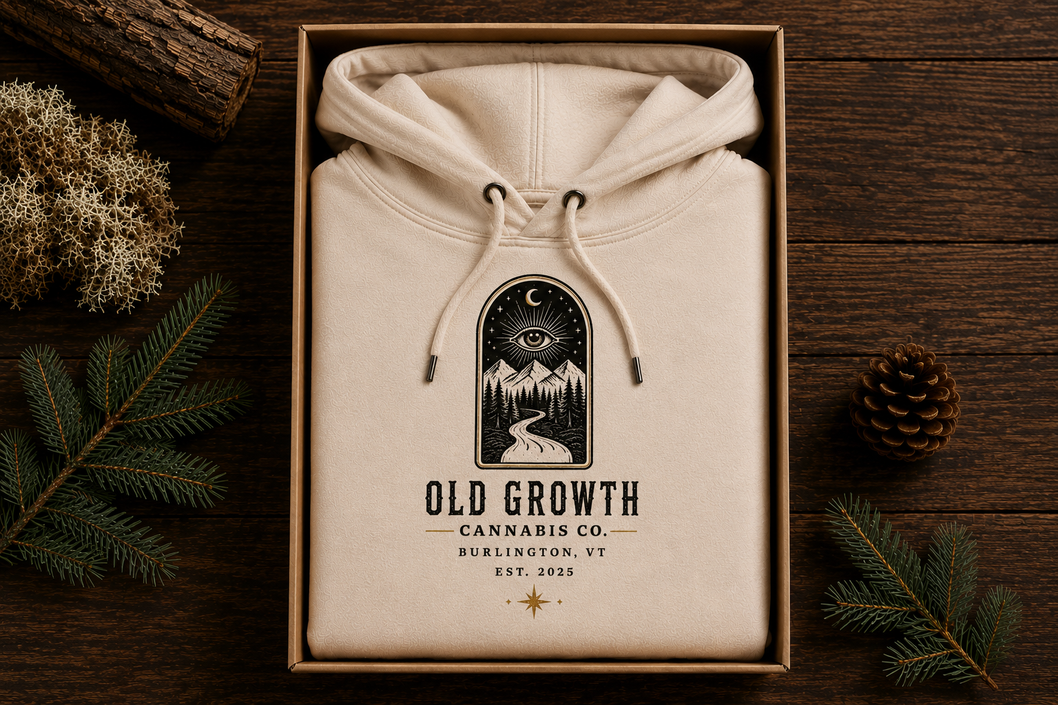
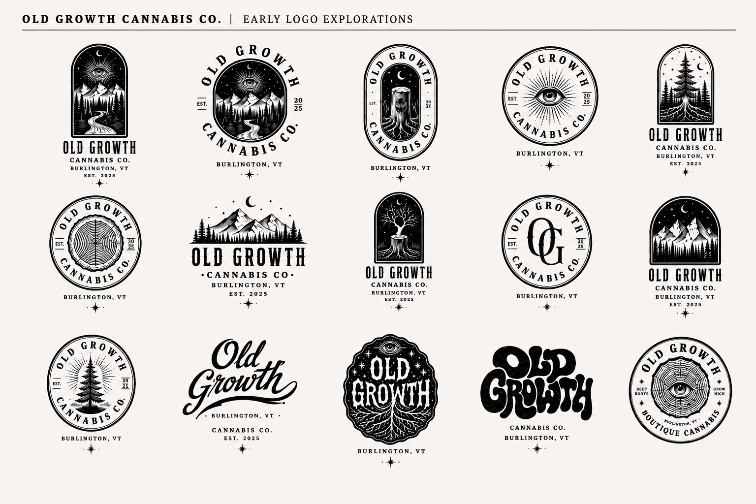
The identity evolved through early brainstorming sketches, logo explorations, packaging studies, and merchandise applications. Initial directions explored tree rings, roots, apothecary seals, hand-lettered wordmarks, celestial symbols, and forest-inspired illustration before narrowing into the final arched emblem: a moonlit landscape featuring a radiant eye, mountain peaks, pine forest, and winding road. This became the foundation for a broader brand system built around mystery, heritage, and quiet luxury.
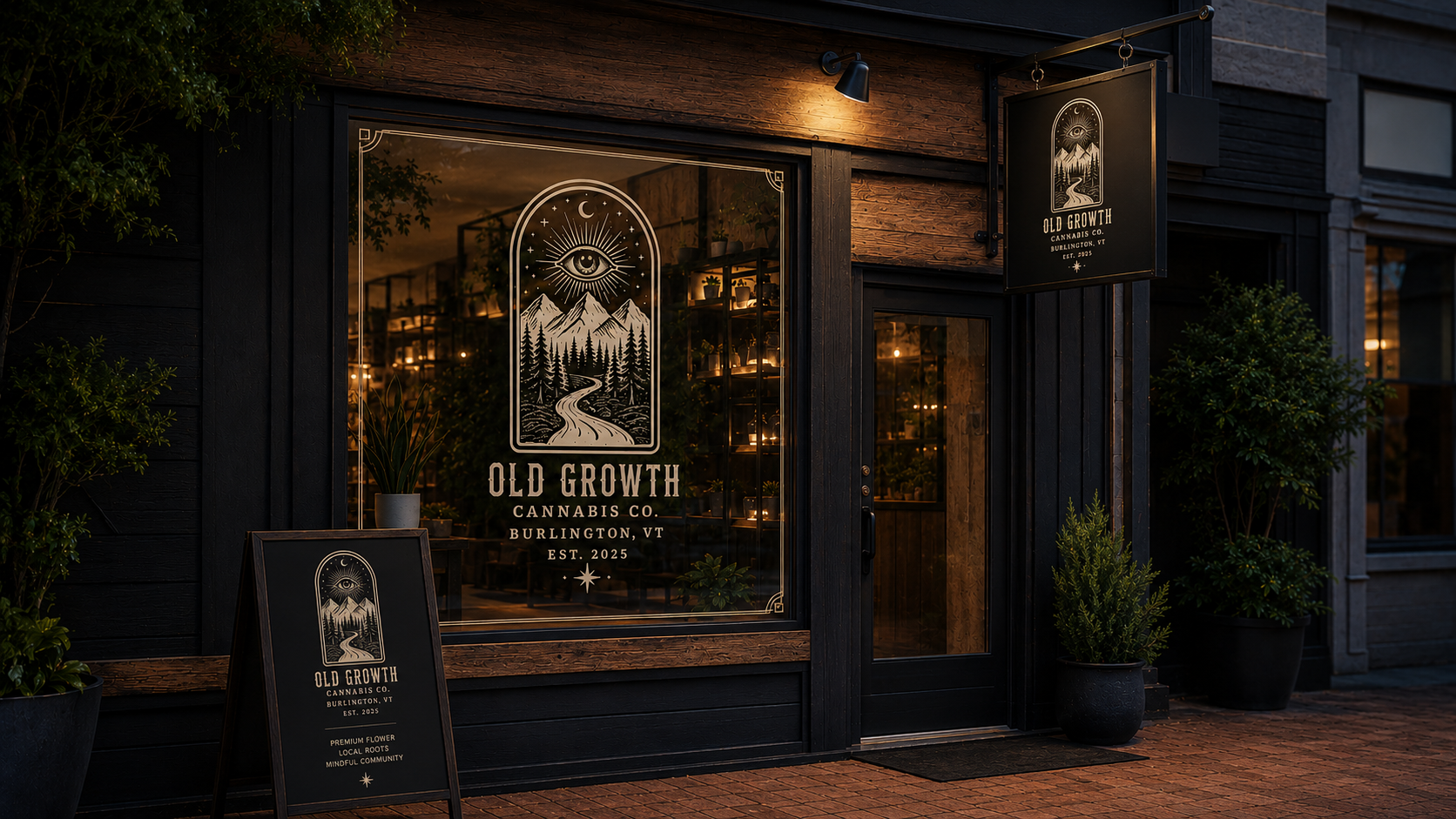
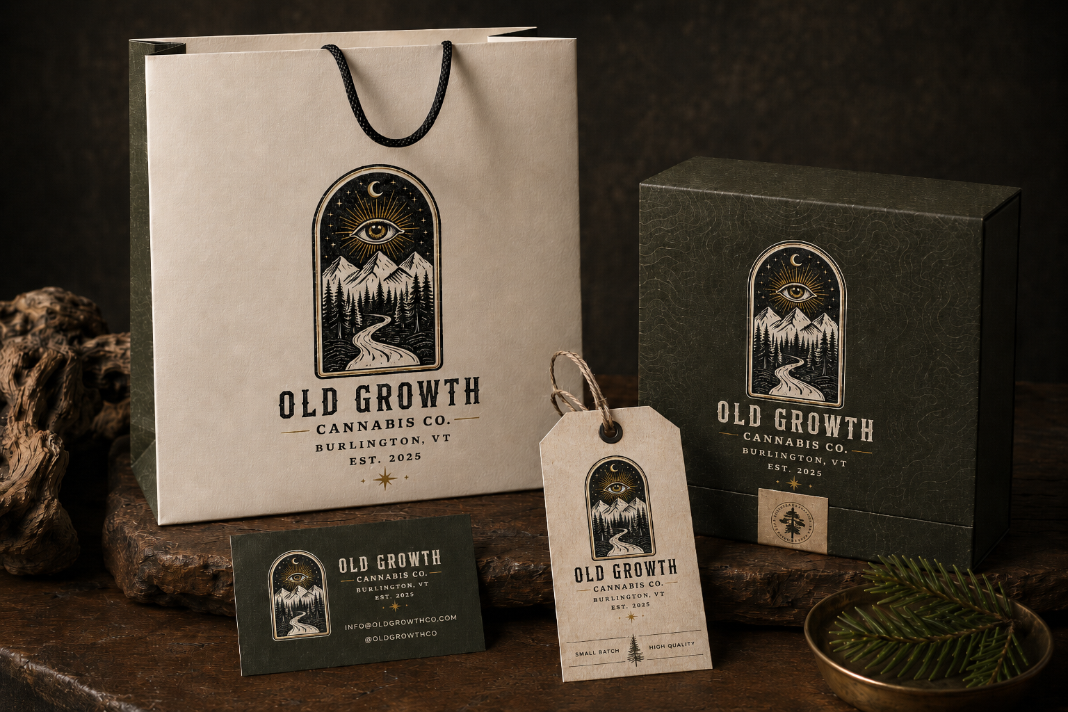
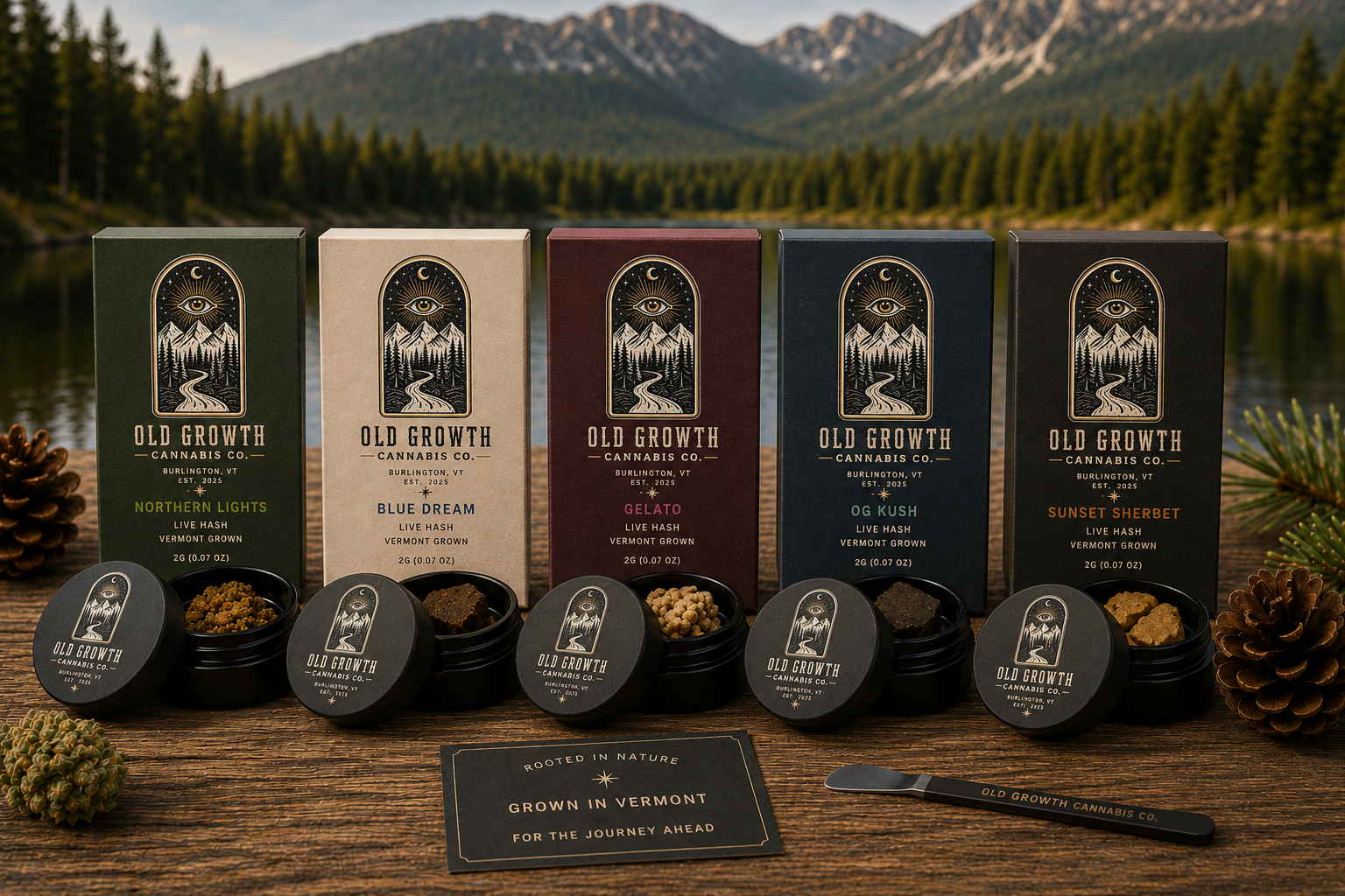
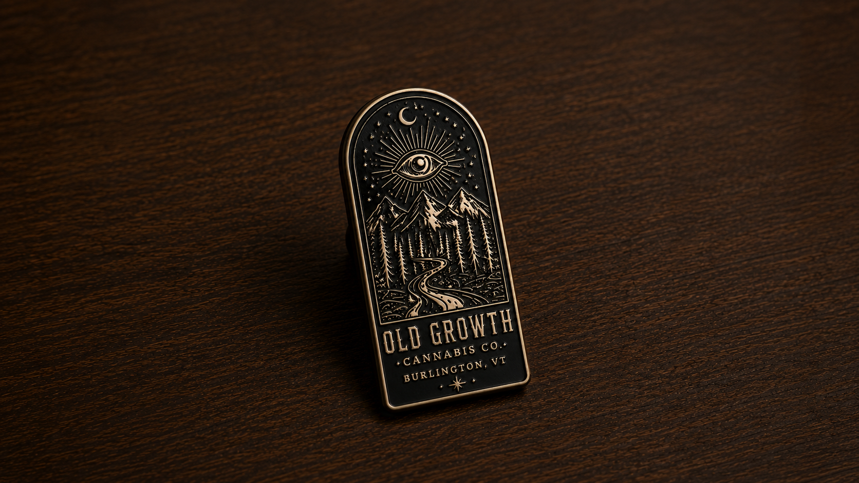
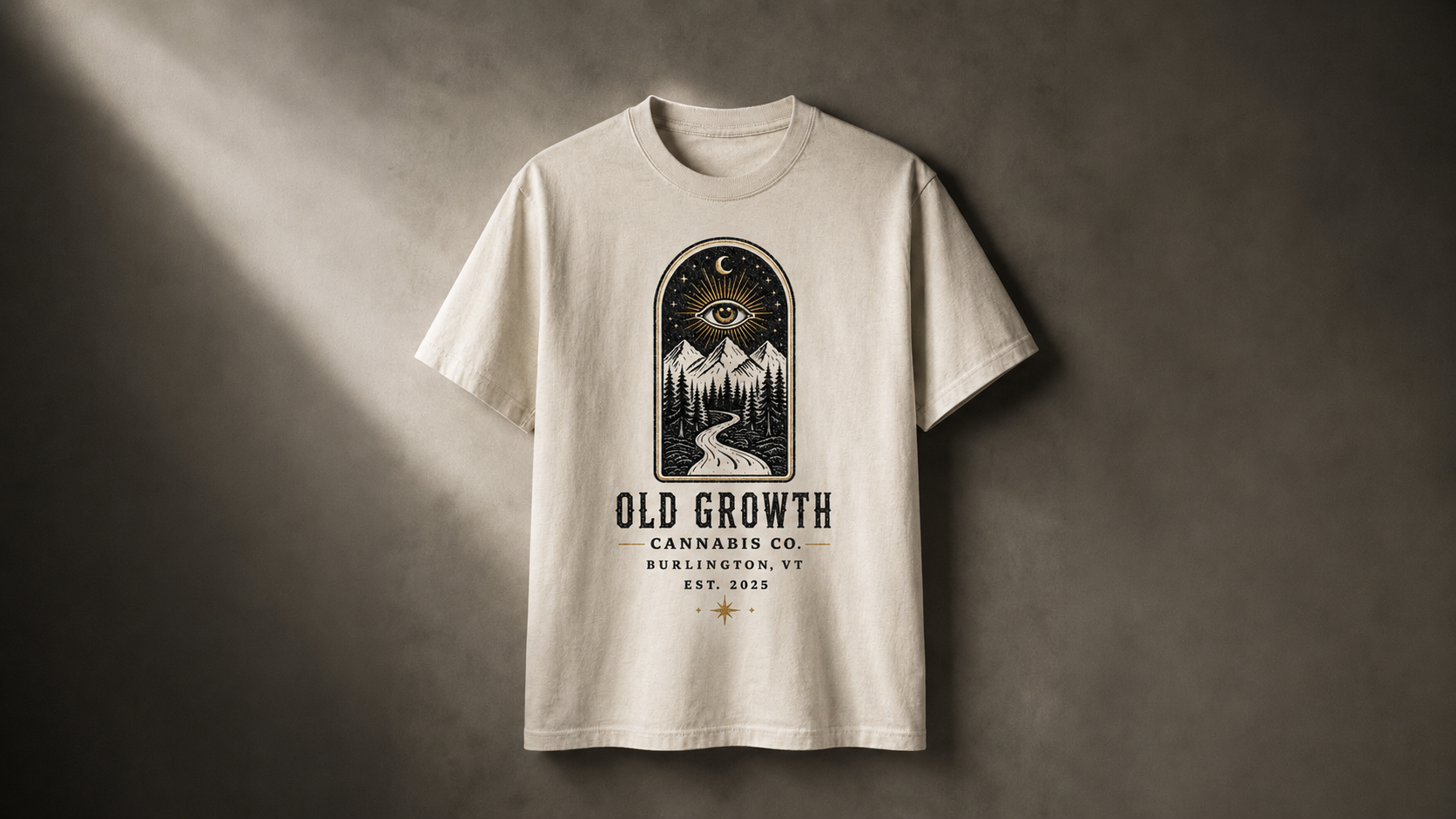
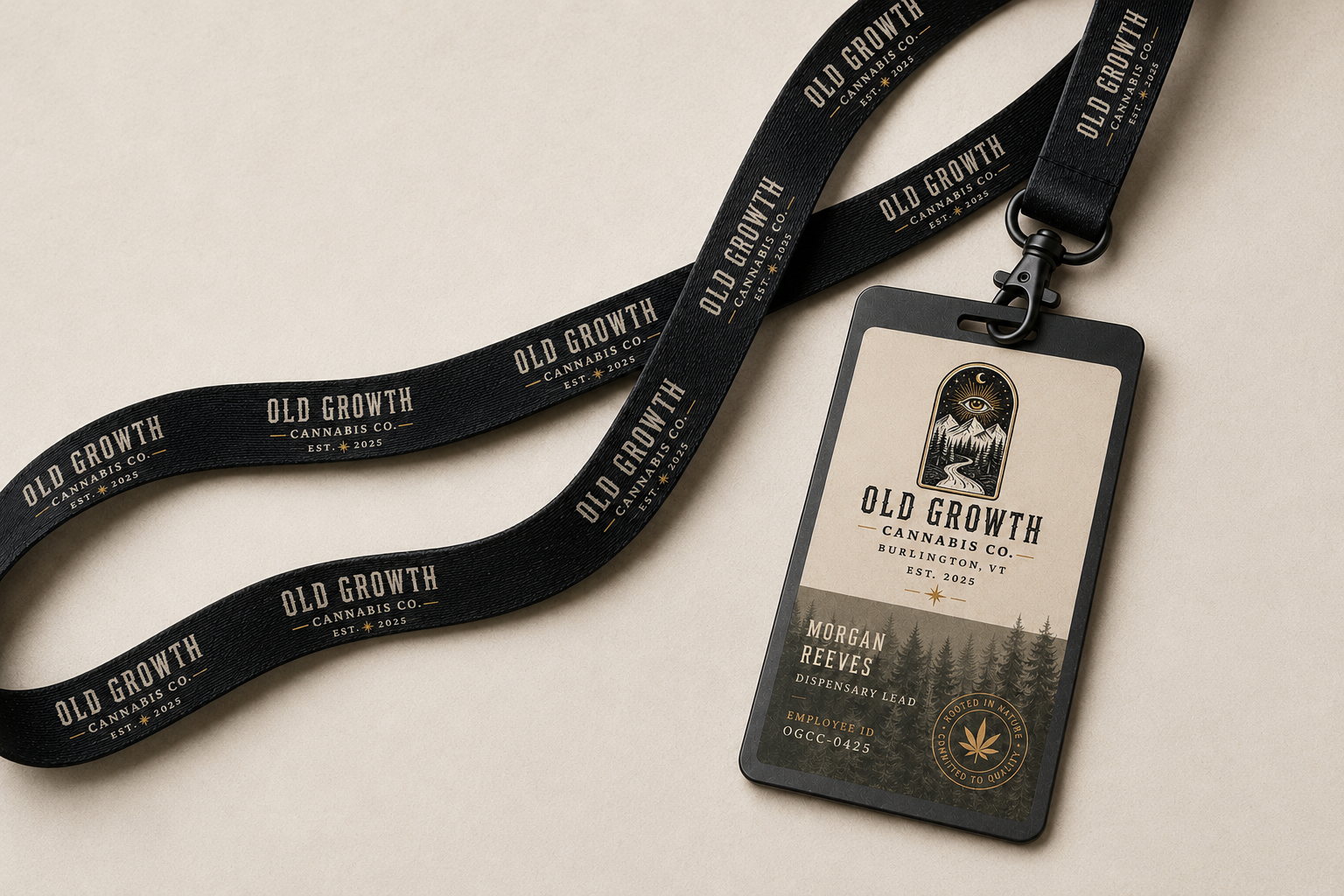
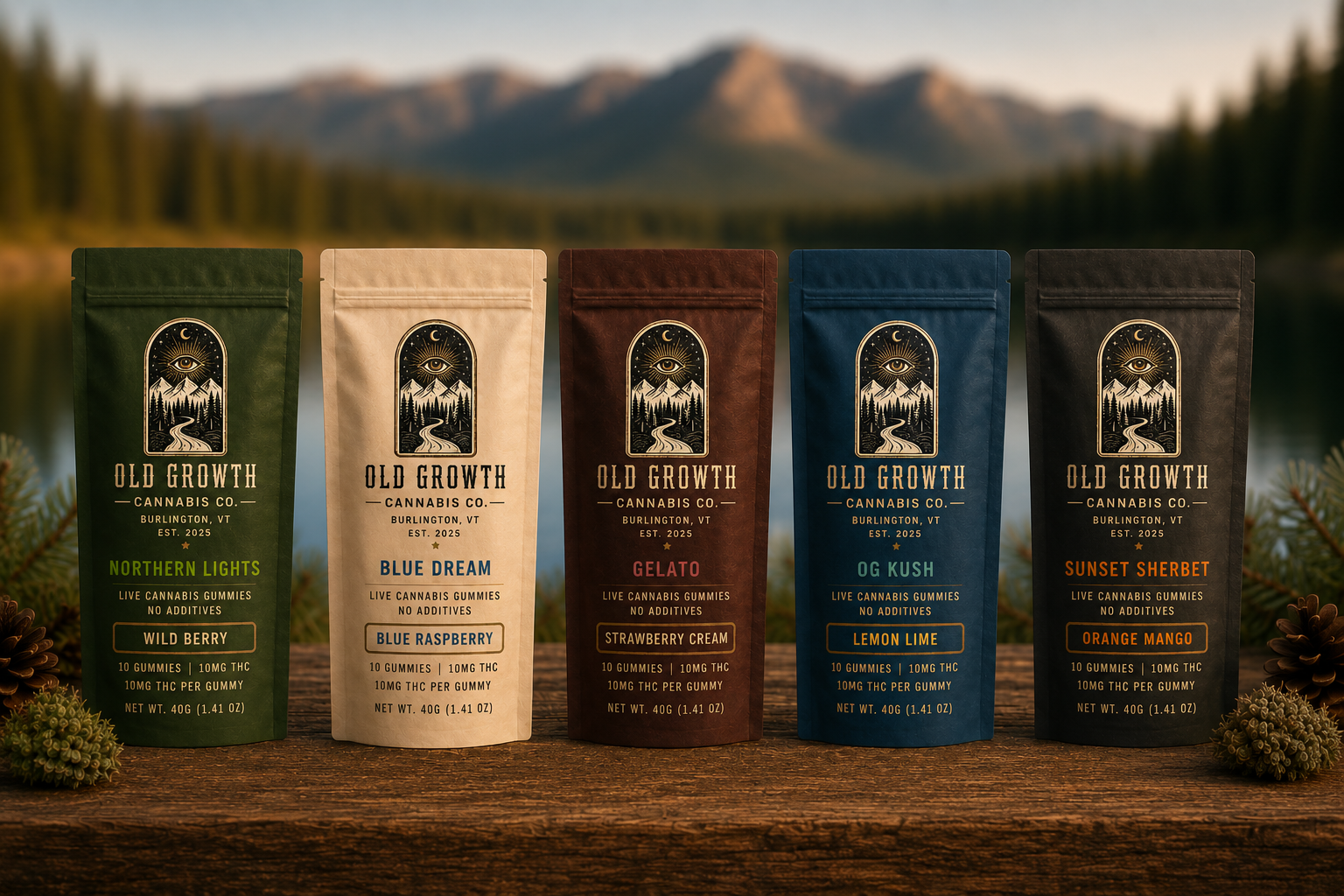
From the final logo through packaging, typography, color, photography, and brand extensions, every touchpoint was designed to feel cohesive and premium. Matte black vessels, parchment labels, restrained antique gold accents, and natural textures helped establish a tactile shelf presence, while lifestyle applications like hats, hoodies, candles, keychains, and employee materials extended the brand into a collectible world. The result is a complete identity system that feels rooted in Vermont, distinctive within the cannabis space, and built for a refined retail experience.
Deep Roots. Grow True.